Fratelli Cuore
packagingFratelli Cuore

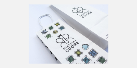
The concept of the new Florentine restaurant reconsiders the idea of station bar that is not more seen as “fast food” but changes in “good food”. Fratelli Cuore is located inside the historic train station, a symbol of Italian Rationalism. The logo was inspired by Depero artworks — Selvaggetto — and represents first of all a holy heart then a fork and last also two person facing each other.
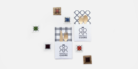
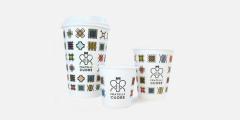
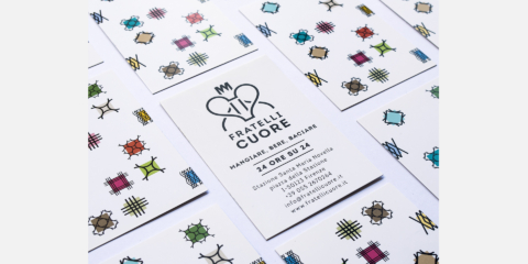
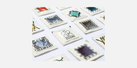

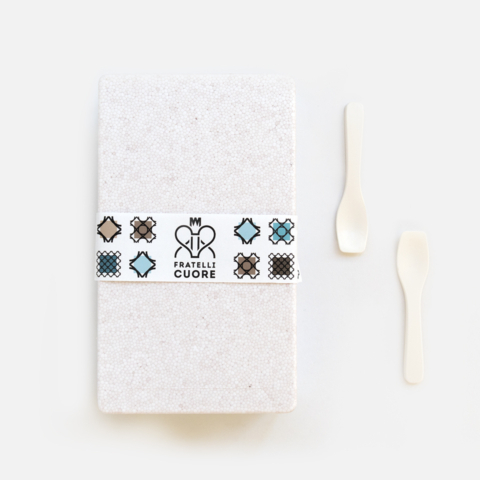
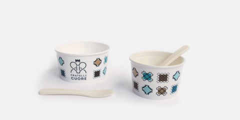

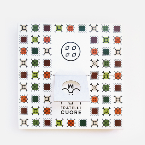
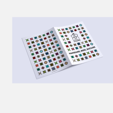
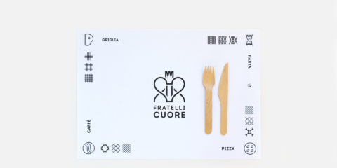
The brand identity was developed around symbols, each of this elements creates a piece of the logo and defines a category of food (pasta, pizza, grill and coffee) with the possibility to make a pattern out of it. Still referring to Futurism, the module system and pattern is mached with a color palette derived from the warm colors and cool colors of classic Italian dishes.